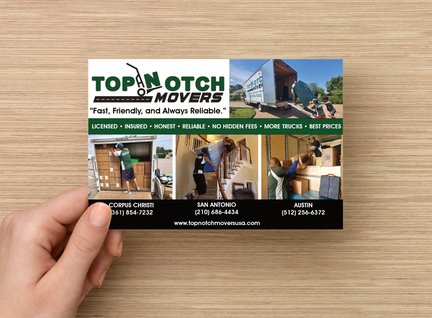
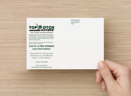
We built a strong digital presence that positions them as Corpus Christi’s top choice for professional and affordable moving services.
For Top Notch Movers, we packed their brand with digital tools that drive results. With a polished, user-friendly website and strategic SEO, we made sure they’re the first choice for moving services in Corpus Christi. Our digital advertising campaigns spread the word about their professional, affordable approach, while graphic design brought their brand to life with visuals as reliable as their service. Now, Top Notch Movers doesn’t just provide peace of mind on moving day; they’re the go-to name for families and businesses looking for a trusted, family-owned team that truly understands what a smooth move means.
Top Notch Movers
Digital Advertising, Web Design, SEO, Graphic Design
Lorem ipsum dolor sit amet.
Although the owners stuck with their current logo, ItsMoose.com had the opportunity to do a redesign of their logo. This logo for Top Notch Movers incorporates thoughtful design elements, colors, and typography that effectively convey the company’s purpose and identity. It also simplifies the design without losing the message and essence of the brand.
The logo for Top Notch Movers is well-designed to appeal to a broad audience, from individuals to businesses seeking professional moving services. Its clever integration of moving-related imagery with bold typography ensures it stands out, while the color palette supports the values of trust, growth, and reliability. The design successfully communicates the brand’s identity and services in a simple yet effective way.
Movement and Action:
Professionalism and Trust:


