Rebranding PEPSI®
Pepsi’s New Logo And Visual Identity Into The Next Era
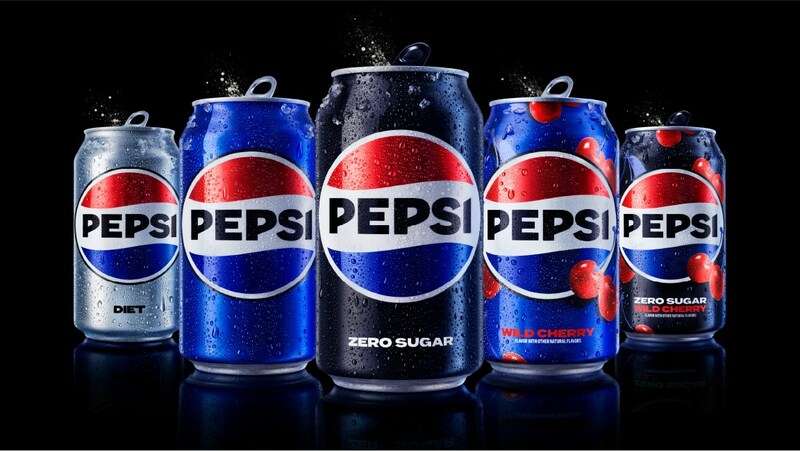
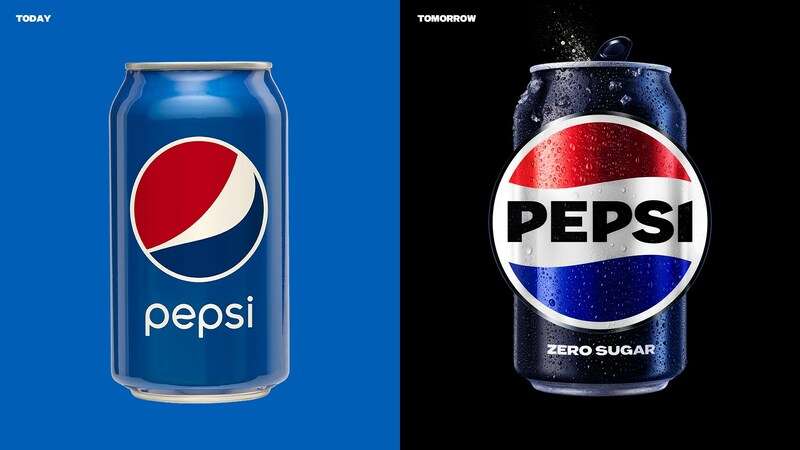
A new visual identity for Pepsi arrives to consumers, which includes a new logo. This is the logo’s first revision in 14 years.
Pepsi states the visual and logo design draws influence from the 125-year evolution of the business. The design reminds of the brand name appearing in a bold type letters within its recognizable blue and red “waves” within a circle from the 1970s to the 1990s.
In the autumn of this year, to coincide with the 125th anniversary of the company, the new visual identity will be available across North America. In 2024, it will go global.
It will encompass all of the branding agency tangible and intangible touchpoints, from packaging to cooler and fountain hardware to apparel and restaurants. With greater “movement and animation” and “unlocking more versatility,” the new identity has been specifically created to appeal in a “increasingly digital environment,” according to Pepsi.
For the first time since 2008, Pepsi redesigns its iconic globe logo. The new identity is the brainchild of the internal design and innovation team at PepsiCo. This is under the leadership and direction of Mauro Porcini.
Pepsi Brand Elements
Globe & Wordmark
The 1987–1997 version of the Pepsi globe and wordmark is identical to the present version, except it has a different font, a different font color, and a slimmer border. It functions in a range of contexts and emphasize the recognizable Pepsi branding.
The wordmark was lowercase and distinct from the globe logomark in the preceding logo. Now it lies inside the logomark’s middle white stripe and the writing in all caps. The wordmark and globe work together to accentuate the distinctive Pepsi identity in a variety of contexts.
Color Palette
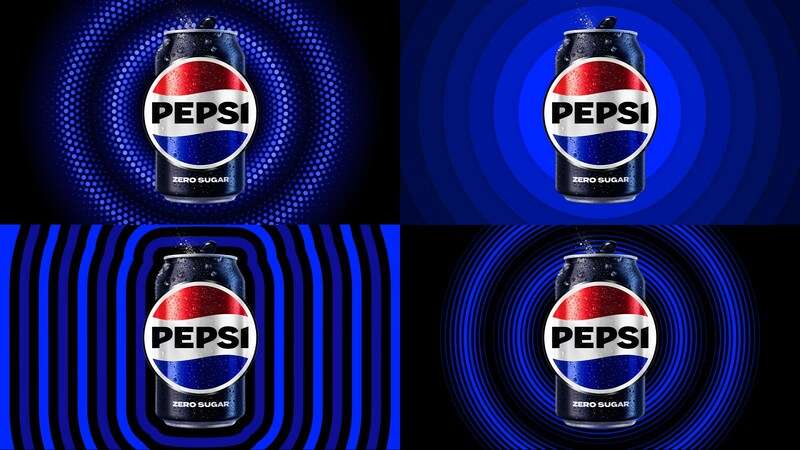
The traditional color scheme is modern with electric blue and black to add contrast, energy, and a modern edge. The design incorporates the color black to further demonstrate the brand’s future commitment to Pepsi Zero Sugar given the company’s ongoing focus on that product.
Pepsi Can Silhouette
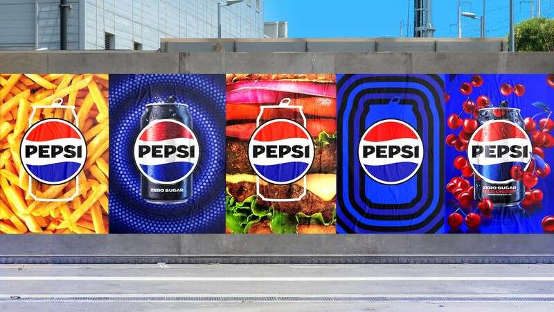
A new, distinctive can silhouette is now a part of Pepsi’s collection of graphic assets in an effort to portray the brand as one that is approachable by everybody.
Typeface
A contemporary, personalized typeface conveys the brand’s assurance and outspoken attitude. The new typeface goes by the name Pepsi Owners. It is an adaptation of the Owners typeface. It strikes “the correct mix between pointing to a familiar appearance and feel on one side, and presenting the unabashed energy and dynamism of the brand on the other,” according to Porcini.
Pepsi Pulse Motif
The Pepsi pulse includes a visual system in order to stay up with the increasingly digital world. Porcini refers to it as “a living and breathing design element.” According to PepsiCo, the pulse “brings the rhythm and intensity of music.” And it “evokes the ripple, pop, and fizz” of Pepsi-Cola. The design team continues, “greater flexibility to move between physical and digital environments, from retail shelves to the metaverse,” is what the pulse represents.
The Future of The Pepsi Brand
The new visual style heralds in a “new era” for Pepsi and will support brand differentiation.
Pepsi has been a mainstay in pop culture and challenged the category for the past 125 years. This makes it an iconic global brand that is evolving continuously.
“Our new visual system takes a major step forward to position the brand up for success in an increasingly digital environment, while bringing out the best of the brand’s rich past.”

