Skip to content
Canal Tool & Equipment
Driving Canal Tool & Equipment's Digital Powerhouse
We built a bold brand and digital presence that matches the strength and reliability of their top-tier machinery.
Canal Tool & Equipment
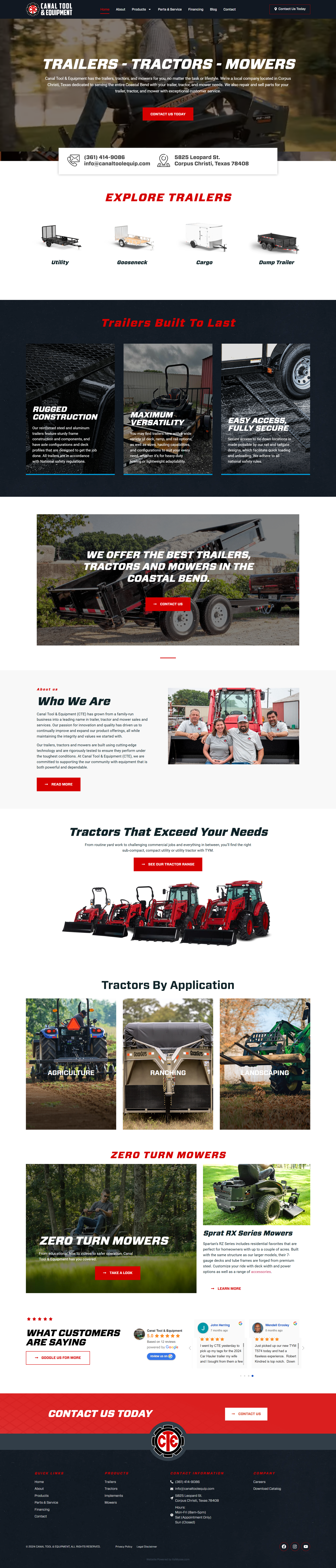
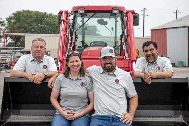
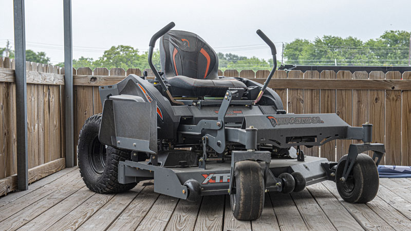
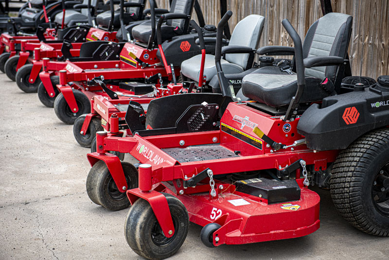
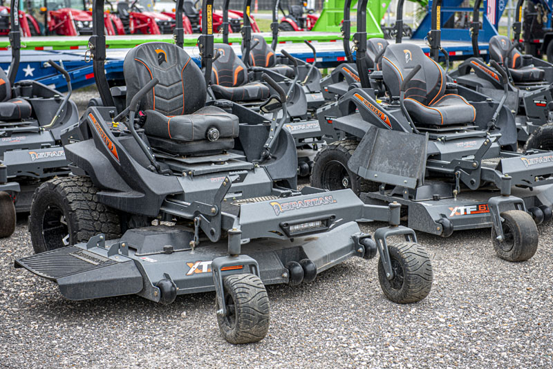
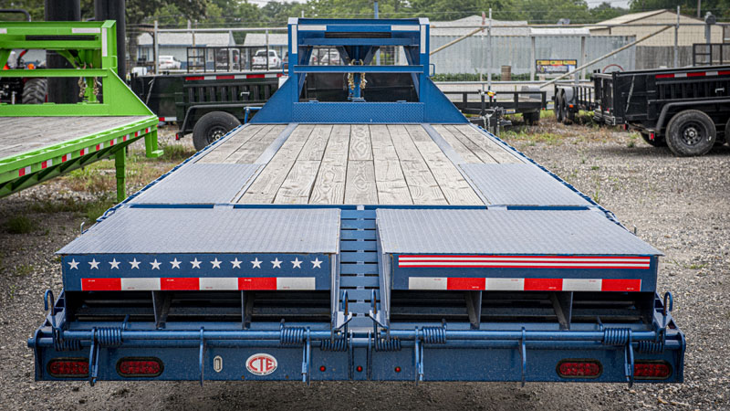
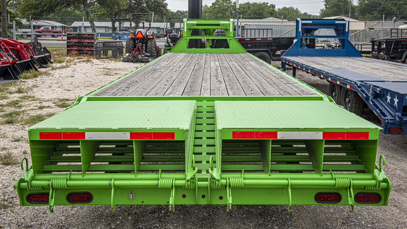
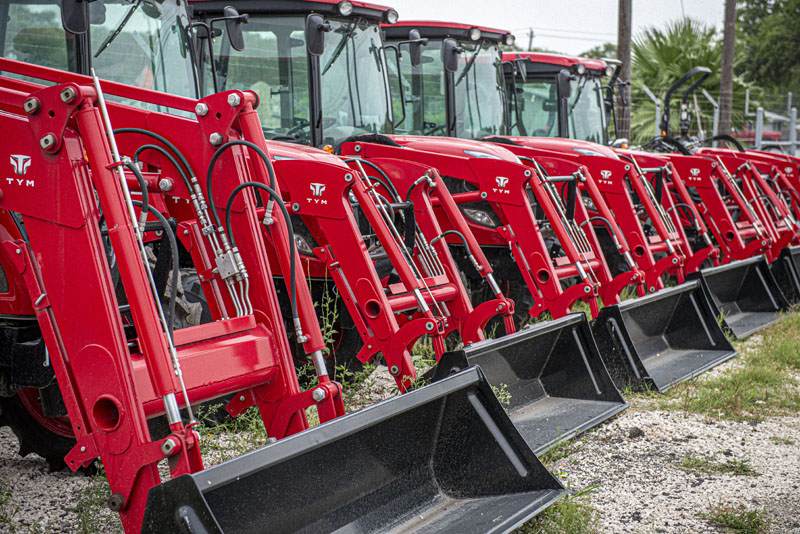
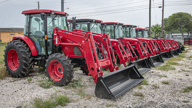
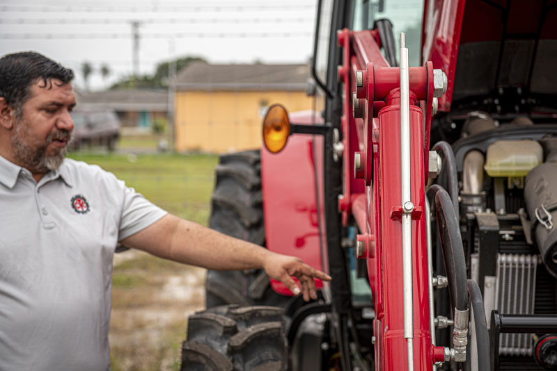
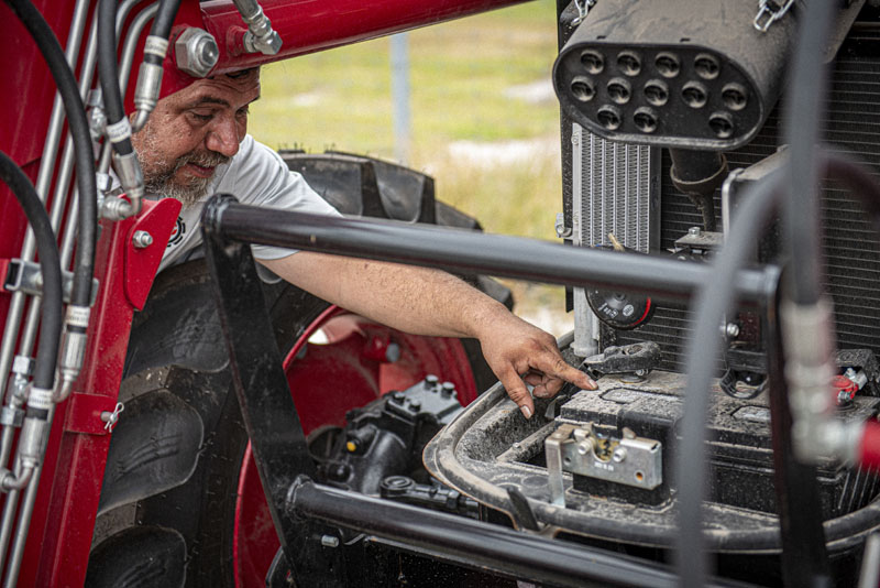
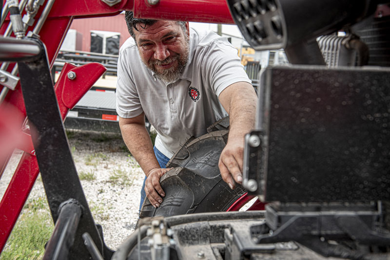
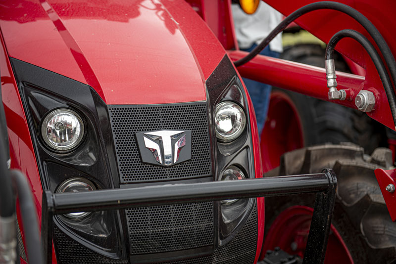
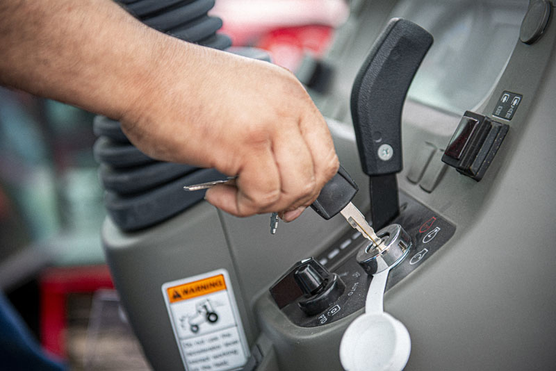
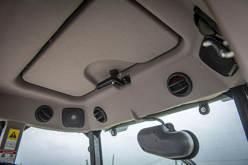
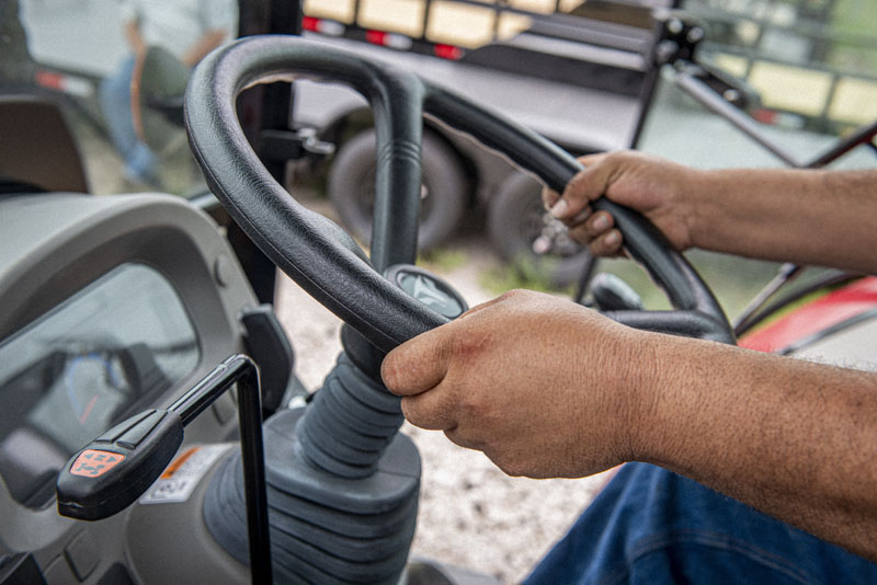
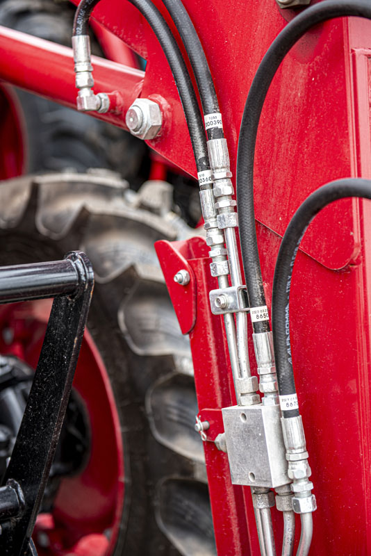
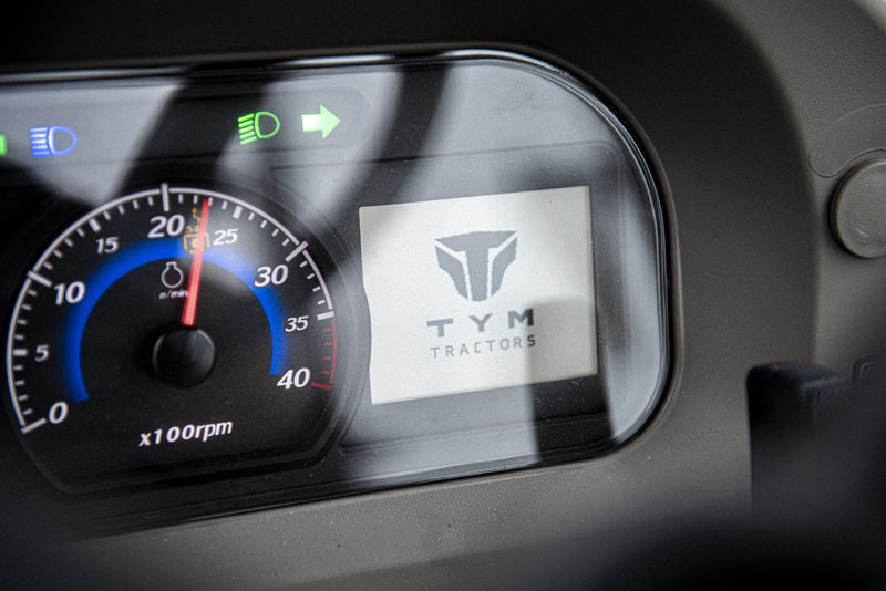
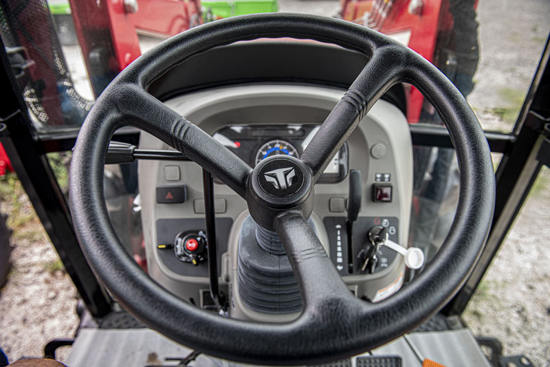
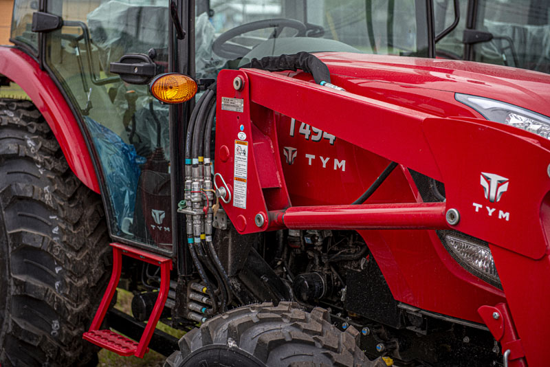
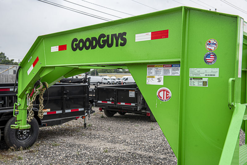
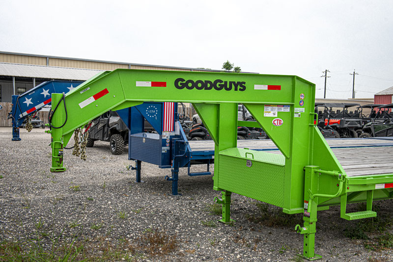
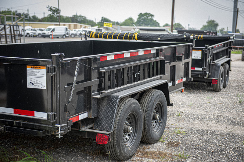
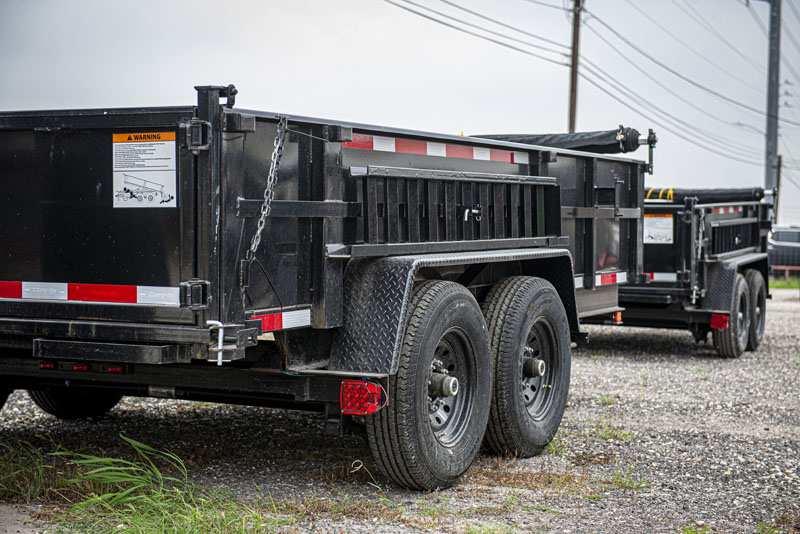
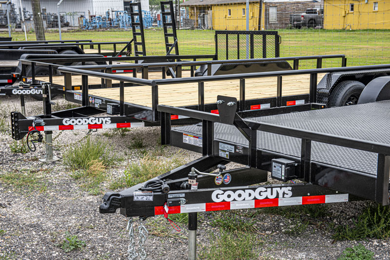
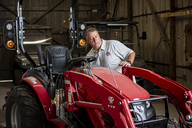
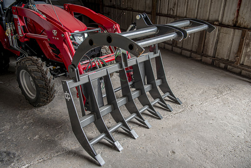
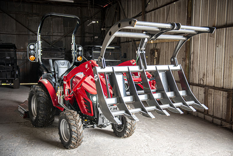
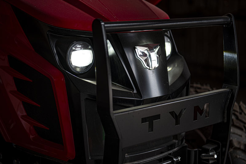
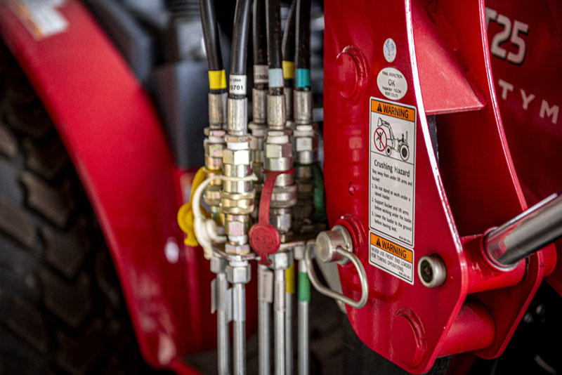
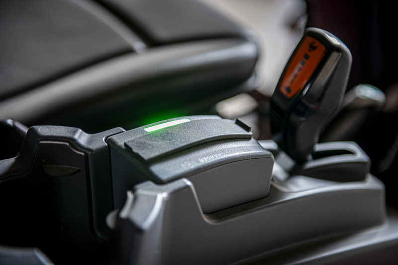
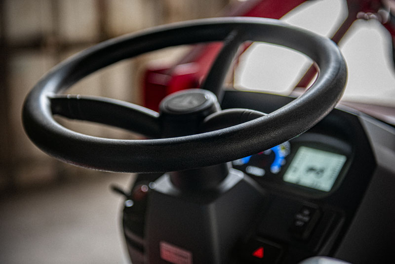
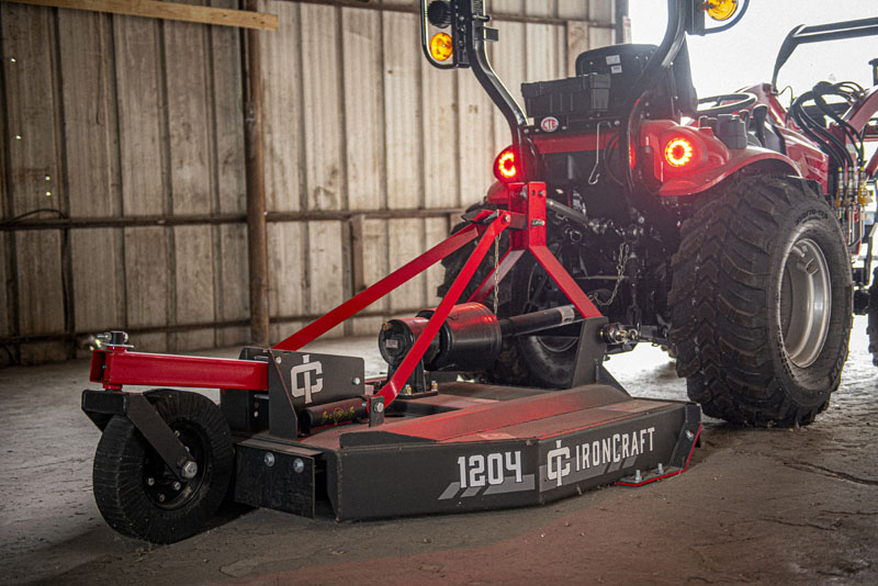
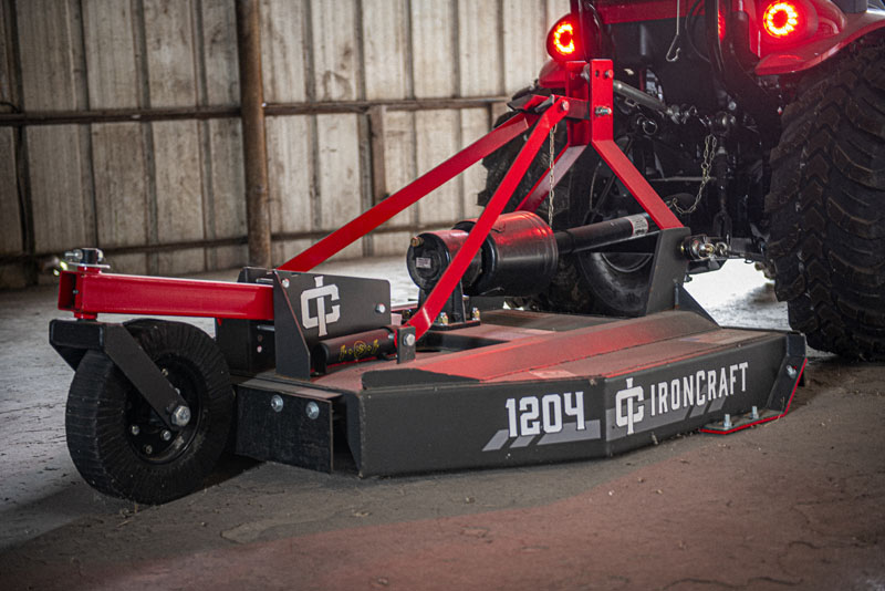
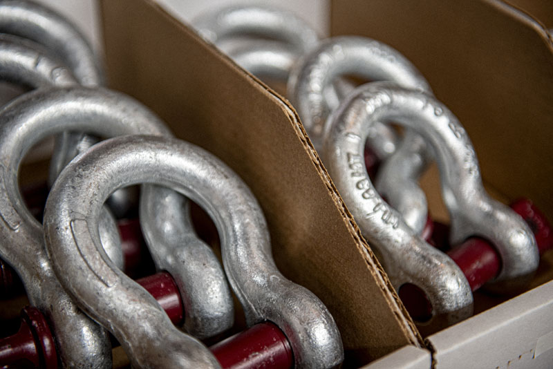
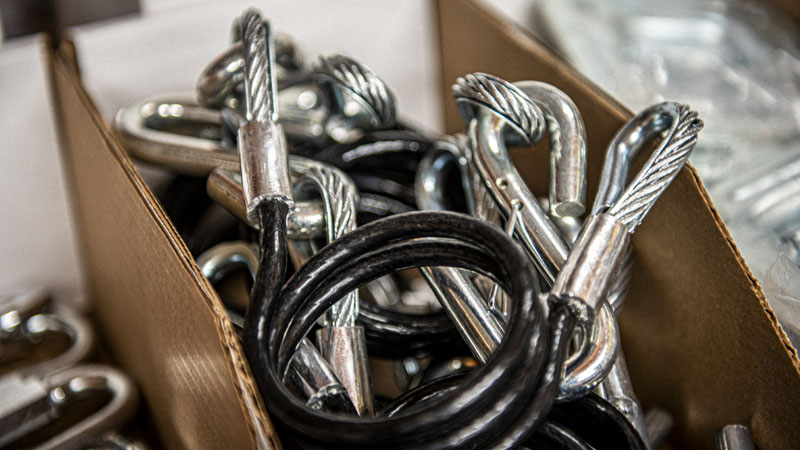
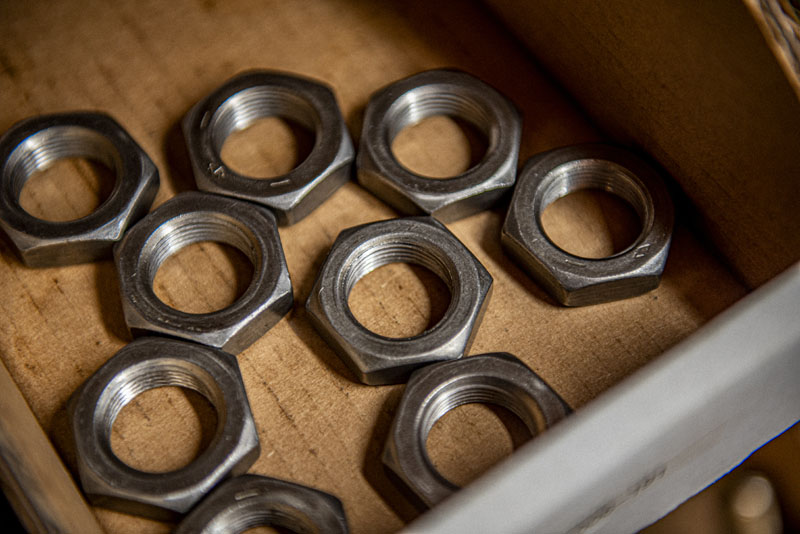
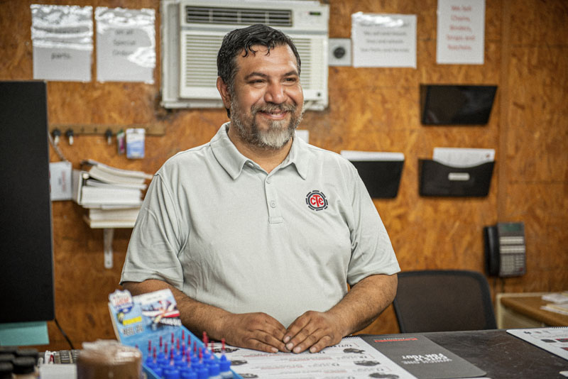
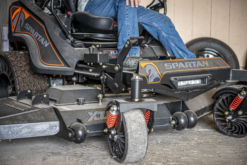
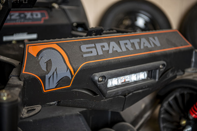
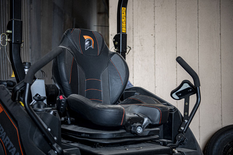
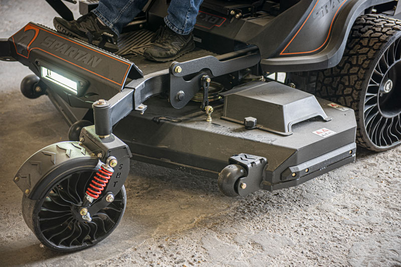
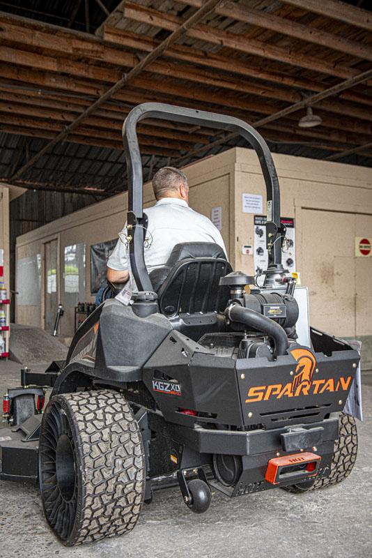
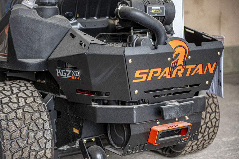
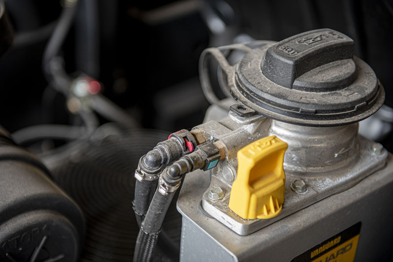
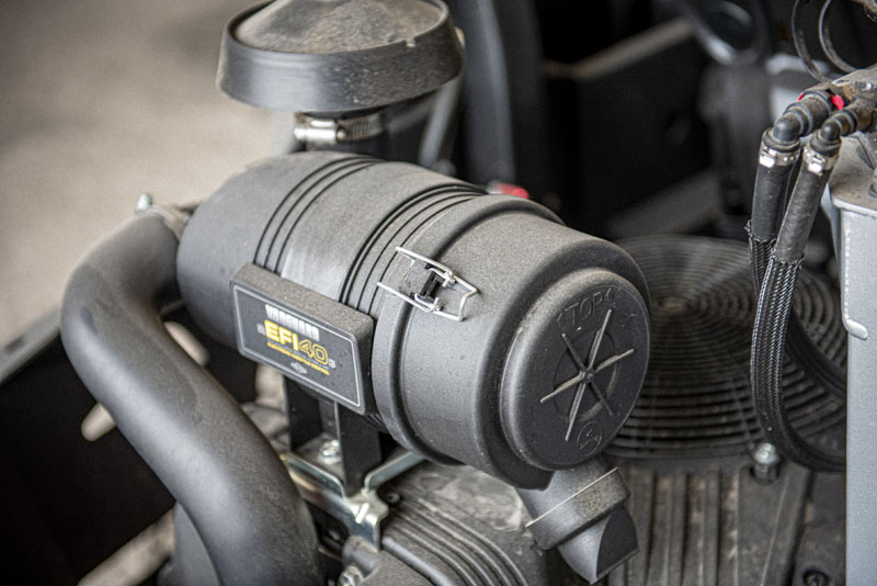
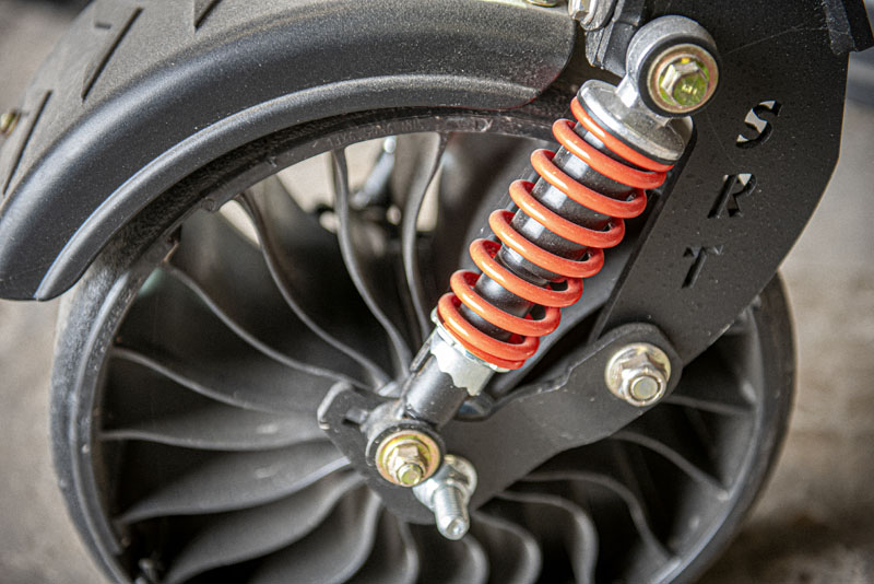
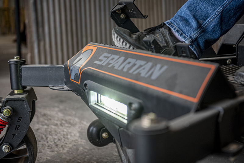
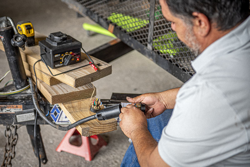
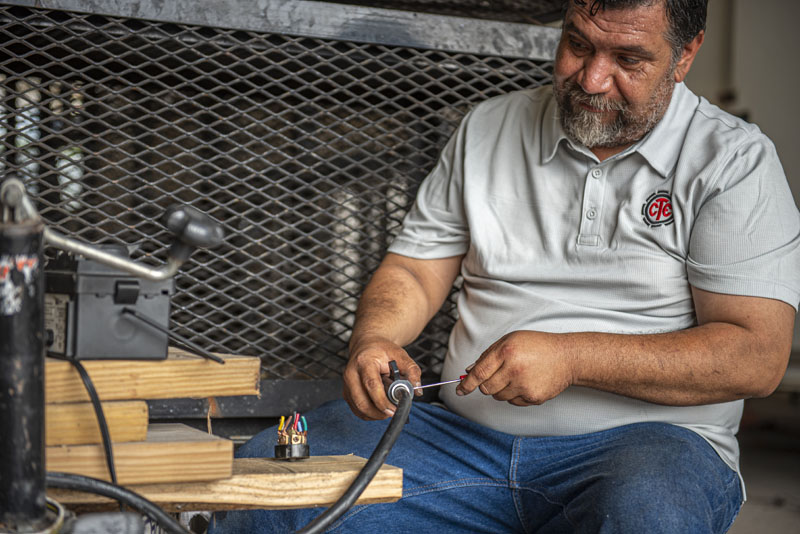
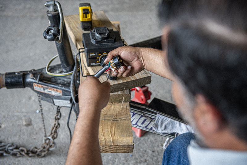
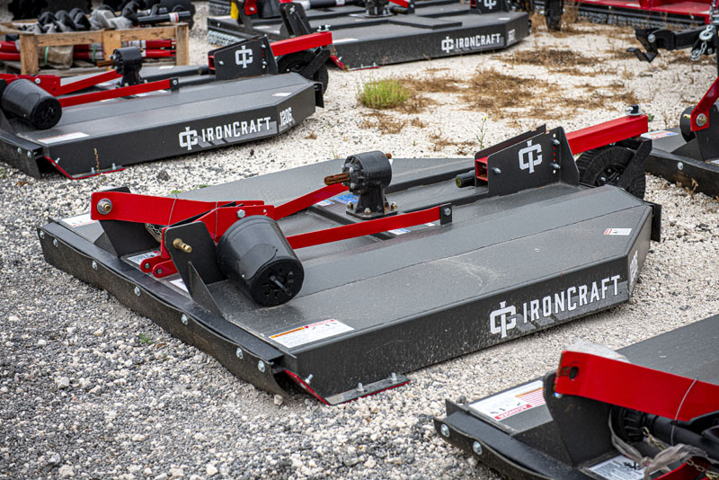
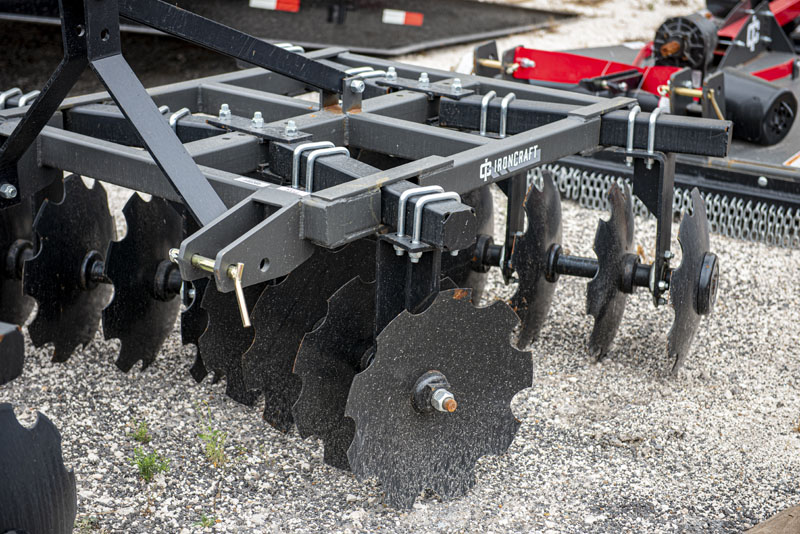
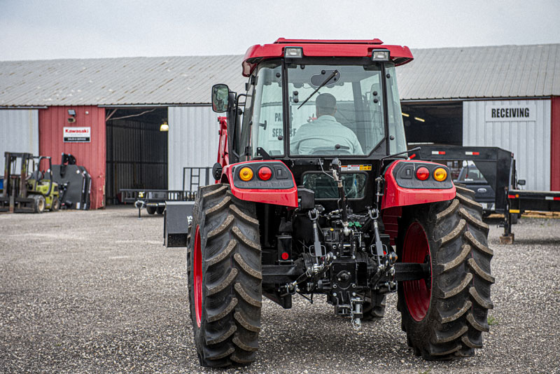
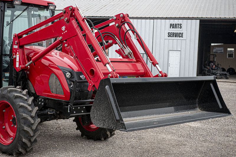
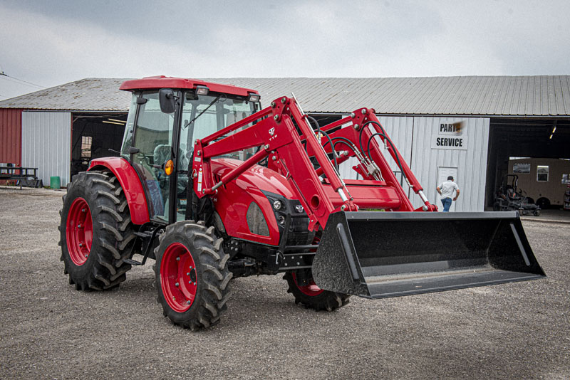
For Canal Tool & Equipment, we revved up their brand to match the power of their equipment! From a bold new logo and animated branding to a streamlined website, we gave CTE a digital presence that’s as tough and reliable as their tractors and trailers. Our graphic design and photography showcase their cutting-edge products, capturing every rugged detail and quality finish. Now, with visuals that speak to their commitment to performance and community, Canal Tool & Equipment is ready to roll as the go-to name in dependable machinery across Corpus Christi and beyond.
Share Now:
Client
Canal Tool & Equipment
Project Type
Brand, Logo Design, Web Design, Graphic Design, Animation, Photography
Impacts
Lorem ipsum dolor sit amet.


Canal Tool & Equipment Logo Design
The Canal Tool & Equipment logo leverages industrial imagery and bold typography to create a design that exudes strength, reliability, and craftsmanship. By incorporating elements inspired by a tractor tire, the logo connects directly to industries that require durable tools and machinery.
Logo Design Elements:
Central Icon – Tractor Tire:
- The black gear-like design encircling the red “CTE” mimics a tractor tire, symbolizing strength, resilience, and the brand’s connection to industrial and agricultural tools.
- The sharp edges of the gear suggest precision and mechanical excellence, reinforcing the company’s technical expertise.
“CTE” Monogram:
- The bold red “CTE” stands out as a strong focal point. It effectively conveys the company’s initials, making the logo easily recognizable and memorable.
- The use of red symbolizes energy, action, and urgency, aligning with the dependable nature of Canal Tool & Equipment.
Typography – “CANAL TOOL & EQUIPMENT”:
- The typeface is a bold, sans-serif font, projecting a clean, modern, and professional appearance.
- Its all-uppercase format communicates authority and dependability.
- The alignment complements the circular icon, creating a balanced and cohesive design.