...

Sugar Botany

Baking Up a Brand: How Sugar Botany Got a Sweet Digital Makeover

Sugar Botany needed a brand as delightful as their desserts, and ItsMoose.com served up a custom strategy that was equal parts charm and conversion. From a visually delicious website to SEO-optimized content, we helped their online presence rise to perfection.

Sugar Botany

The Sugar Botany brand beautifully represents the art of baking with natural, botanical inspiration, making it a visually appealing and memorable brand identity. The combination of a delightful cupcake design, fresh green accents, and a warm, inviting color palette positions Sugar Botany as a modern, artisanal, and nature-inspired bakery that stands out in the market.

Share Now:

Client

Sugar Botany

Project Type

Web Design, Menu Design, Graphic Design, Video & Photo
Logo Design Concept

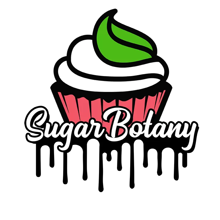
The Sugar Botany logo is a playful and elegant blend of baking and botanical elements, reflecting the brand’s focus on beautifully crafted desserts with a natural, artistic touch. The cupcake icon is the centerpiece, incorporating a leaf-like swirl of frosting, seamlessly merging the themes of sweetness and nature.

Design Elements

  • Cupcake Illustration

    • The logo features a stylized cupcake with a white swirl of frosting, topped with a green leaf-like flourish.
    • The cupcake liner has a ridged texture, adding depth and a handcrafted feel.
    • The design strikes a balance between modern, clean aesthetics and playful artistry, making it appealing to dessert lovers.
  • Botanical Swirl (Green Leaf)

    • The green frosting swirl resembles a leaf, symbolizing freshness, natural ingredients, and an organic touch.
    • This reinforces the “Botany” aspect of the brand name, making it unique and visually intriguing.
  • Typography

    • “Sugar Botany” is in a script-style font, evoking a sense of warmth, craftsmanship, and artisanal quality.
    • The mix of bold and delicate curves makes the brand feel both sophisticated and fun.

Brand Identity & Message

The Sugar Botany logo reflects:

  • Sweetness & Creativity: The cupcake icon and script font exude charm and artistry.
  • Natural & Fresh Appeal: The green swirl reinforces a botanical, possibly organic or handcrafted aspect of the brand.
  • Elegance & Playfulness: The fluid typography and bright colors balance fun with sophistication, making the brand feel approachable yet premium.

This branding positions Sugar Botany as a go-to bakery for high-quality, beautifully designed desserts, potentially with an emphasis on natural or unique flavors.

Brand Kit

Logo Design

Web Design

Logo Animation

Business Card Design

Photography

SEO

Graphic Design

Print

Seraphinite AcceleratorOptimized by Seraphinite Accelerator
Turns on site high speed to be attractive for people and search engines.