What Goes Into A Great Logo?

blog-thumb-6-1
Written by:
Published:

November 6, 2022

Tags:
Share now:

What Goes Into A Great Logo?

Think about every famous brand in the world. The first thing you think about isn’t the founder, it’s origins, or what they do necessarily. They think of the logo. The image that’s on a box or package on the shelf among several products, the design that dominates on a shirt or shoe, the icon that you tap on your iPad or mobile phone.
It’s the face of the company and has a HUGE impact on how a prospective client perceives your brand and organization. Believe it or not, what people expect from your business can be influenced by their reaction of your logo at first glance. Think of it as a first impression, and if it’s a poor one, can hinder whether or not someone decides to do business with you.
Let’s use a simple example. Suppose a company has a tree right in the middle of the logo. The customer can assume it has to be related to an eco-friendly policy and “green” in nature. They could perceive it to be something related to the environment, purity or cleanliness of the product, etc. But the company may not even sell or service anything to promote conservation or improve the world.

The Logo Concept

Typically a logo design is not 100% the efforts of the founders. It’s the constant effort between the founder, possibly a marketing team and the graphic designer that draws out the vision. This is necessary to make sure the logo is consistent and covers all the points the company wants. Remember that a logo MUST symbolize and represent the BEST of the company. It should be something that is not confusing to the target audience and can be worn proudly by employees. It has to represent the spirit and style of the company. Finally, it has to be something that is easy to visually remember with little effort and meet modern standards. Nothing less that what is mentioned before is a disservice to the company and needs to be redone and replaced.

So what makes a great logo?

When logos projects are started at ItsMoose.com, we take a tremendous amount of effort to spend time understanding the business, the industry and services offered by the company. We add to that by going through a “checklist” to produce a great logo that has strong value.

Successful logos contain the following principles:
  • Simplicity: Is the design simple, easy to remember and clean enough to be flexible in multiple formats?
  • Memorability: Is it easily recognizable? How long does it take to the target audience to understand it?
  • Immortality: Will it still be a great logo in 10, 20, or even 50 years from today? 
  • Versatility: Does it scale to different sizes without losing quality? Will it work across various media and within different contexts? Can it translate to a white or black version and still not be too busy, or confusing?
  • Appropriateness: Finally ask yourself, DOES IT MAKE SENSE to the target audience?
Some of the most iconic logos were made on these principles. Paula Scher who created the CitiBank logo, drew the Citi bank logo on a napkin while interviewing the executives. Check the Citibank logo sketch here. She mentioned, “It took me a few seconds to draw it, but it took me 34 years to learn how to draw it in a few seconds.” Rob Janoff, who made the world-famous Apple logo thought about the imagery. He stated, “The bite in the Apple logo was simply introduced so it couldn’t be confused with a cherry.” Lindon Leader, the designer who created the FedEx mark in 1994, placed abstract and powerful symbol in the logo. “The arrow connote forward direction, speed, and precision, and it remains hidden.”

Representing the Company

Every company has their unique style that represents the products and services they offer and a market differentiation of how they do business in the industry. Take for example this logo ItsMoose.com created for Gifted Hands, a private provider company in the Corpus Christi and greater Coastal Bend area. The new logo is an homage to the original company name, “Gifted Hands of Love.” The simple heart felt universally right and two hands reaching out in different directions signifying help from multiple directions. The inspiration of the logo has subtle Christian faith influences (as per client’s request). The heart and hands are positioned in such a way to follow the cardinal points of direction like the Cross and in some ways the hands can represent Angel wings of the heart.
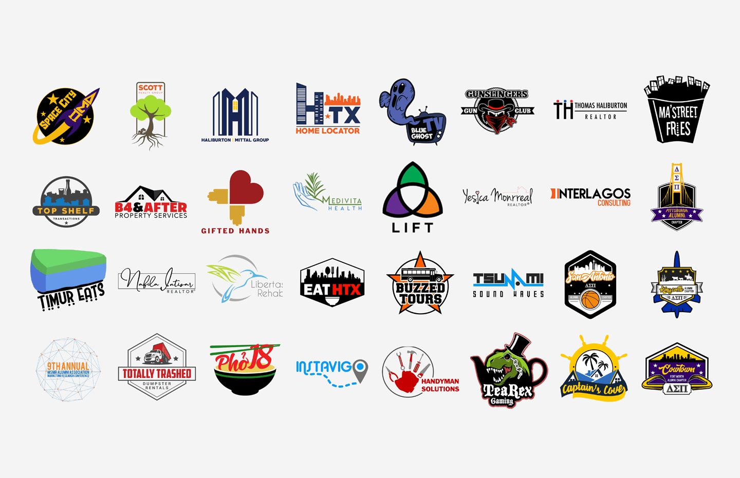
a graphic of different company logos ItsMoose.com made
gifted hands ppc logo

The Target Audience

Let’s take the Halloween season as an example. When you think Halloween, you may think spooky and symbols of the Netherrealm or an undead nightmare. But in retail, you might think pumpkins, fall leaves, and seasonal candy. What candy brands immediately come to mind? The top brands might be M&Ms, Hershey’s bars, and Reese’s Pieces. Now you’re walking down the candy aisle. What logos are you looking for? What colors are going to be in your mind? Customers scan the shelves for packaging that’s friendly, recognizable and easy to spot.
Health conscious parents and athletes might pick up trail mix with come candy while kids might go for the tastier, sugary products. You might start to think that customers are buying particular candy because they have a relationship with the brand, as it satisfies their needs. They automatically assume that a company with a relatable logo must understand them and have their best interests at heart. This is where representation must be accurate and positive for your brand.

Applications of the Logo Design

A question that seems obvious at first, but should be asked is, what are you using the logo for? A well-thought-out logo have serve in multiple capacities. It’s not just about placing it on a piece of paper or a sign in front of the business. How is it going to look on an app or saved link on your phone or iPad? What about on commercials? Is it going to lose value and aesthetic embroidered on a shirt?
The point is it needs to look good at ANY size and on ANY item. Whether it in a round or square frame, in grayscale or full color. It has to conform with any icon standard. On top of all this, it also has to pass the “checklist” above and be well-designed.

Final Thoughts

When you hire a logo designer for your brand, consider having them develop a brand identity style guide. This is important because it prevents headaches and improper use of your brand messaging. By setting guidelines, the designer sets your brand right from the beginning for use by anyone.
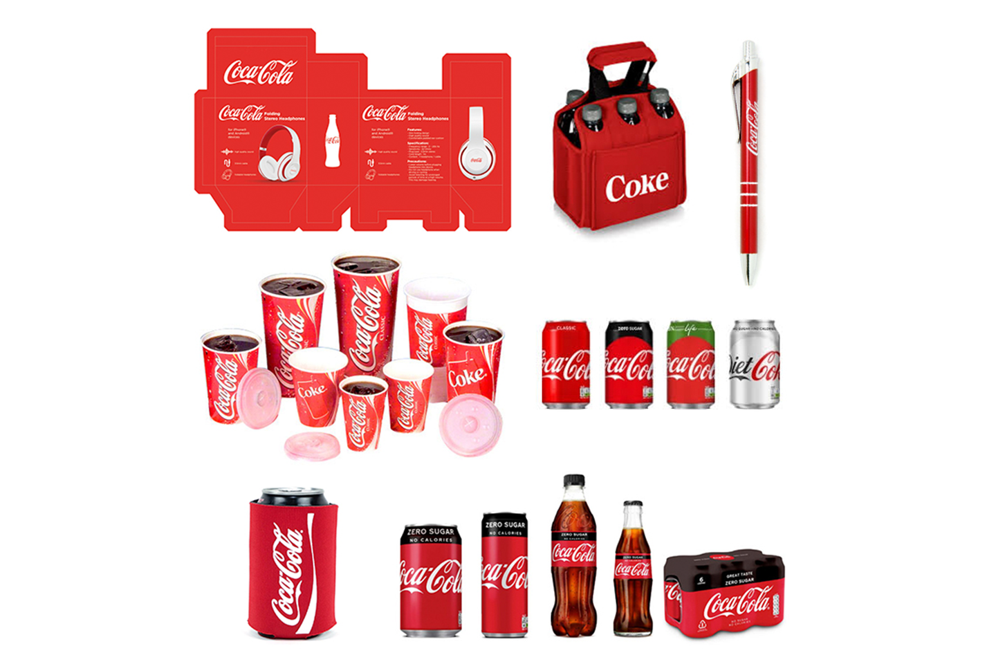
In the example below, Coca-Coal successfully communicates their brand across all forms of materials from their simple and iconic cups to packaging, signage and product design. At a glance and without the need for their name even showing, you know exactly which brand this is and the aesthetics.
Interested in establishing or changing up your brand? Contact us today for more information or to start your consultation with one of our expert branding strategists.
examples of promotional items made for coca cola

Related Posts

Kum & Go Rebranding: A New Era for the Midwestern...

Packaging design plays a crucial role in how consumers perceive...

In the construction industry, digital marketing is crucial for business...